Just messing around with some funky charting in SSRS here..
So I was browsing www.gov.uk/government/statistics the other day, like you do, and found this random dataset:
River Tyne monthly upstream fish counts, provided by the Environment Agency.
It’s a table of monthly combined upstream counts for salmon and sea trout at the Environment Agency fish counter at Riding Mill on the main River Tyne, for the last 20 years or so.
I kind of like it. It’s small, succinct, not too complicated… and delightfully fishy. I actually have another, slightly more subversive use for it in mind, but this morning it struck me to try and turn this fishy river data into a watery looking chart.
I’m using SSRS here. I know it divides opinion, but what I most like about Reporting Services is the amount of control you have over everything. It’s definitely a coder’s reporting engine. You can make it draw the reporting you want, rather than have it dictate what your report looks like. And I know what I want my chart to look like!
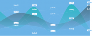
So effectively what I’m aiming for is an evolution of a clustered smoothed series plot. Let’s build a basic one of those:
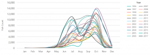
Hmmm… A bit busy. Hard to spot any trends or year-or-year information from that.
But while we’ve got it here – this is SSRS 2016. Let’s add another time dimension and take a quick look at what the default version of this chart looks like in SSRS 2016 versus SSRS 2012. All I’ve had to change here is the interval on the category (month) axis, added 50% more line width, and in this version the default colour palette to “SeaGreen” (yes I know it makes it even harder to read this particular chart but bear with, as it’s the kind of colour scheme I’m ultimately aiming for!)
Use the slider to compare SSRS 2012 on the left, 2016 on the right.
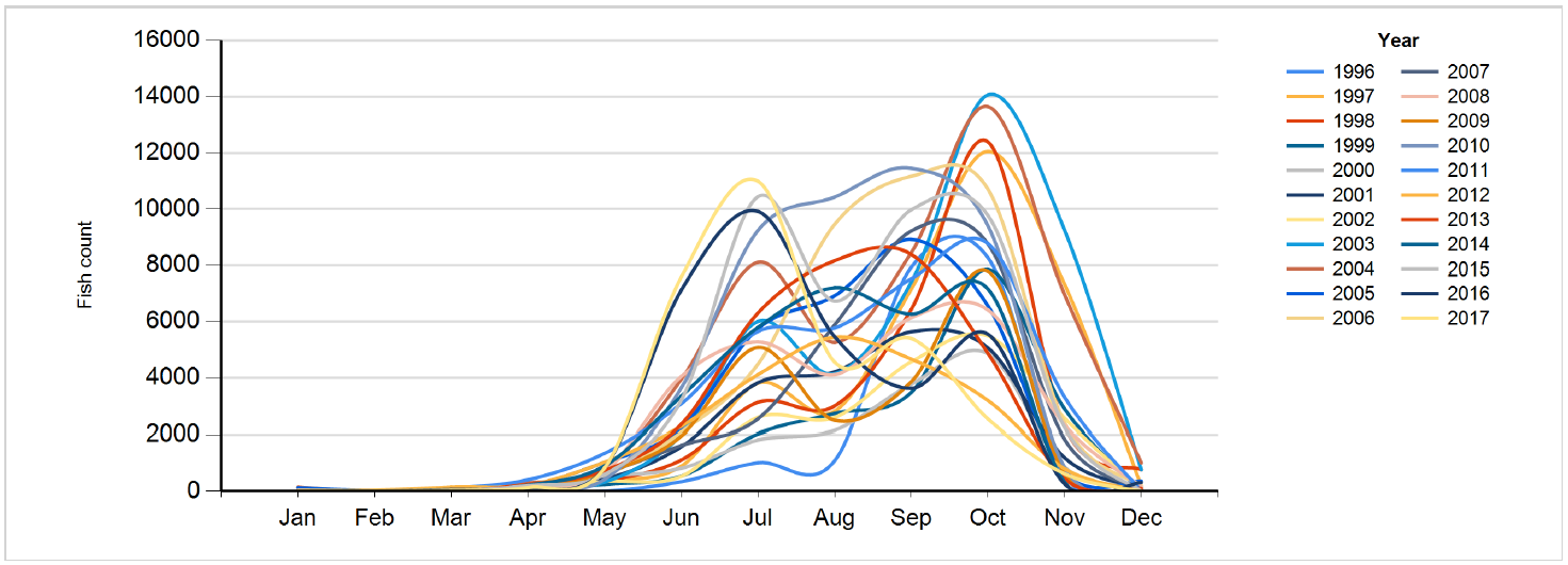
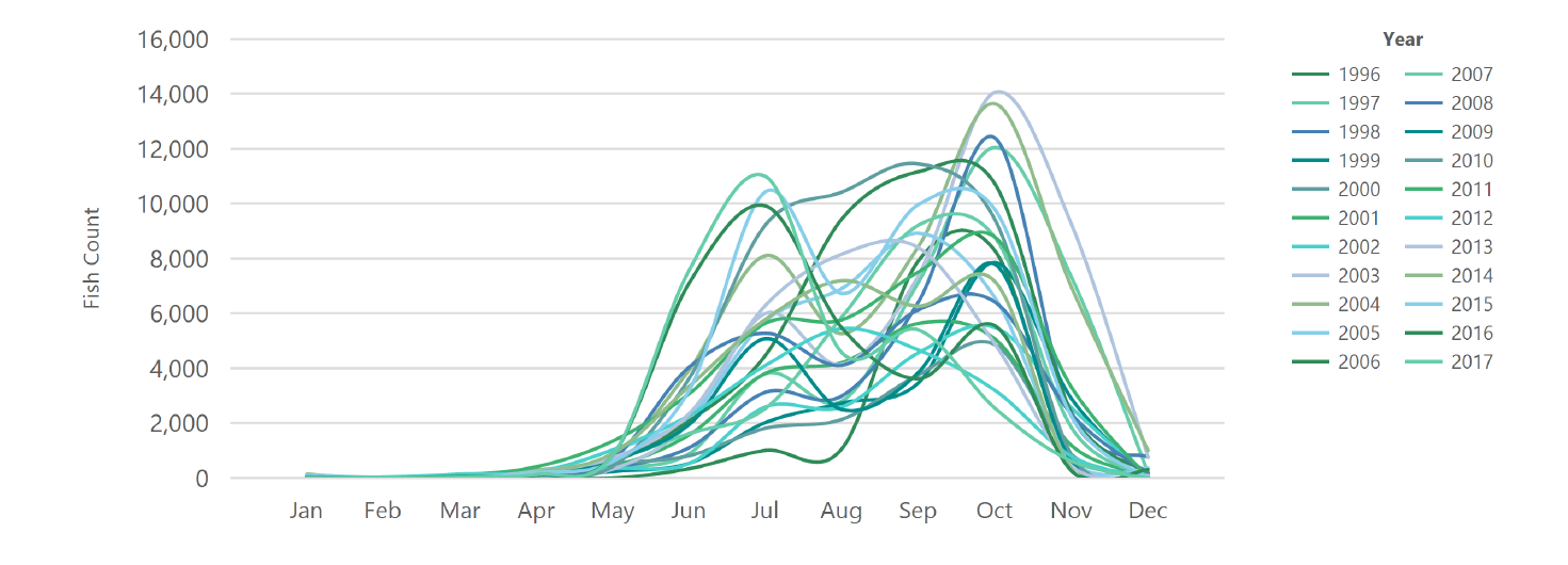
Interesting, don’t you think? They’ve definitely, finally, modernised the look of SSRS this time around. Yes, you can change all those settings manually if you want – and I always do – but it’s nice to be guided down a less ugly path by default. A nice touch from Microsoft.
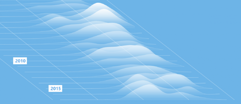
The final graphic
So my vision is to take the equivalent of that horrible chart above, and create a 3D, stacked, ripply looking, wavey kind of chart.
Something which looks a bit like waves on the sea. (Yes I know this is river-based data. Indulge me)
So this is what I’ve come up with.
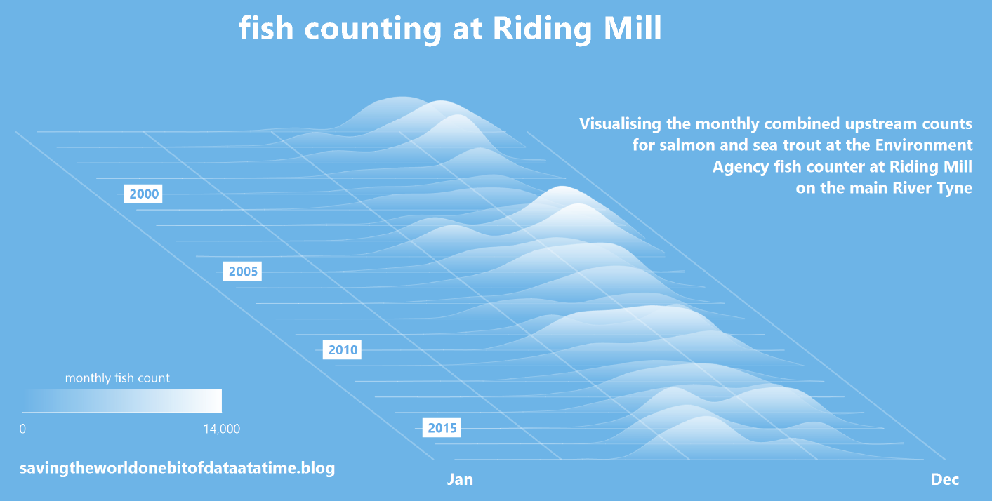
Click to see the full-size image.
This is straight out of SSRS. The only post-processing I’ve applied is to render the report to PDF for beter image quality, then extract a screen shot to PNG format with a nicely cropped border.
Some coding notes:
– The height of each wave part is relative to the biggest count (the 14,066 in October 2003) – the specific height is relative, but chosen to give a pleasing – but not overwhelming – overlap of each year’s layer.
– The colour scale is based on a TopBottom background gradient ranging from the background colour (with a bit of transparency) at the bottom, to at the top a computed shade rising to white for that highest peak in 2003. The shade of the top colour for each annual series is computed and returned in the SQL query. This ensures that equal values are shaded equivalently across the chart.
– Together, the colour scale and the series plot positions ensure that the chart shows all the salient information without the need for any other colouring.
– Each of the annual plots, the 5 diagonal lines, and the scale are all displayed as individual elements of the same chart, with a new data series for each year and each diagonal. Three different value sets with chart types Smooth Range, Line, and Range respectively.
– The year numbers, month names, and scale maximum and minimum are labels for the different chart elements, with all the values returned by the SQL query.
– I cheated for the label for the scale maximum – when I saw the biggest value was that close to a round thousand I cut corners slightly and hard coded the nearest nice value. It’d be pretty easy to programmatically assign the value with the ceiling() function though.
– The 4 areas of fixed texts – title, description, scale title, and URL are all floating (CustomPosition=True) chart titles. Chart titles are a great way to add ad-hoc labels to charts, as long as you know where you want them to go.
The report itself – the SSRS part – is really rather simple and uncomplicated. Most of the work is done in the SQL – which itself is rather elegant and not unwieldy. Simples!
One last thing I though I’d share. Having finished the report, I noticed that I kind of like the look of the chart as it’s rendered in design mode…
It’s kind of relaxing. Maybe I’ve discovered a new art form – beautiful code!
Leave a Reply