About
Pie
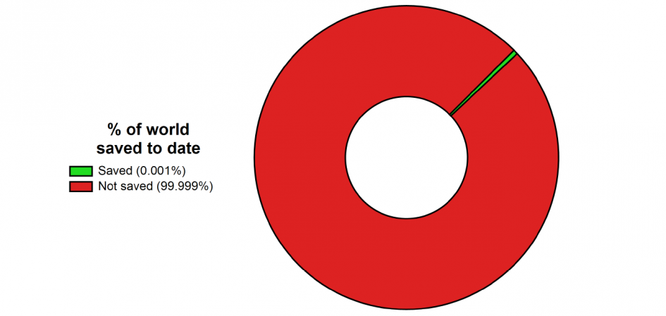
The pie chart at the top of the page is totally fake news for a whole host of reasons.
1. It’s not a pie chart – I chose a donut over a pie since the donut chart is better able to show thinner slices of pie on a finite pixel screen
2. The proportion of the “saved” slice is way bigger (actually about 0.5%) than the reported figure. Again, because you just wouldn’t be able to see the reported figure of 0.001% – do the maths: if the chart was 100 metres wide, that amount of slice would still only be about 3 millimetres wide at the edge (π millimetres if you want to be precise).
3. The reported figure is still overestimated by about 0.001% …
4. The word is “doughnut”
What?
It’s just my little place on the web where I can share with you some of my work, some data, some ideas, some code maybe… and so on.
My day job has me playing with data all the time. Moving it about, cleaning it up, making pretty charts out of it, etc. Most of that work and data is pretty dull (to you) and maybe a little confidential too, but I quite like doing it – so I’m sharing some random other (and much more exciting!) data for your delights instead. Just because. Enjoy.
Why?
Why Saving the world, one bit at a time?
Marketing!
I’d planned to set up this site for a little while, but the best I’d come up with for a name was something similar to, but totally semantically equivalent to “My boring data blog”.
Then quite by chance my colleague Esther set up a work meeting with the cryptic and exciting sounding title which now sits enticingly at the top of this website – it was an otherwise dull (to those who aren’t totally excited by data) meeting to try try to find and reduce spam traffic from our company’s Google Analytics stats, but Esther is a marketing professional and knows how to spin things around…
I liked the name, asked nicely and, well, here you are!
And franky, however stupidly long the resulting URL is, you’re still way more likely to type that in to a browser than “myboringdata.blog”.