
So here’s the first of a possibly semi-regular feature called Mundane Monday (you now have The Mamas & The Papas stuck in your head..) where I’ll try to find an “interesting” dataset from the narrowest and least interesting seeming source, and then try to sex it up a bit with some sort of visualization.
I’ll try to come up with something silly and trivial in my life, like the coins in my pocket, or dirt on my cat’s paws, dirty mugs in my sink. Something totally un-data-worthy…
In this instance I’ve looked to a bit of a folk hero at savingtheworldonebitofdataatatime.blog – Dave Gorman. But it’s Mundane Monday, so I’ve tried not to look very hard.
The data
The data source is the wikipedia entry for Dave Gorman’s Modern Life is Goodish. Er, that’s it.
Follow the link before you read on. There’s not a lot to go on is there?
There’s a big long table of data with some numbers associated, but hey a table of data would be way too easy. And somebody else will have drawn a chart of viewing figures before me anyway…
Is there anything else? No.
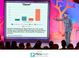
Hang on, “Dave” gets a lot of mentions. That’s a bit of repetition at least, so might throw up some patterns. Maybe there’s some mileage in the hierarchy of different entities called Dave which get a reference on this page? The TV show, the TV channel (and maybe even the TV repeat channel) and Dave Gorman himself. Hmm, it’s a bit tenuous – but suitably mundane, perhaps?
The graphic
At some point during the creative process, I also realised that this exercise would also allow me to build a data visualization chart with the actual title of “Dave” – I didn’t plan it that way, but it totally fits the theme for Mundane Monday. (Apologies to all Daves out there – there nothing wrong with your name. As a name for you. Just that it’d be a really crap name for any other data chart than this one!)
But frankly, there’s not a lot of data to present here, so I’ve tried to add some frills with a bit of background art which Dave Gorman fans might, er, recognise.
You might have also noticed the little picture at the top of this page with the row of paper cut-out Dave Gorman heads. It’s got nothing to do with the final infographic, but I though it looks really cool and almost “charty” in appearance, and maybe helped lure you in from the home page? It’s donated courtesy of weepaperpeople.co.uk.
Piktochart
For this exercise I thought I’d give Piktochart a go. This is an “easy-to-use infographic maker” online tool which on the face of it looks like its geared up as more of a graphic design with added charting kind of thing than a full-blown analytical engine.
I’ll admit I must have spent no more than 5-10 minutes getting to know Piktochart and building my graphic, but it does seem to be pretty good at what it does, and definitely easy to use. Markedly easier to work with out-of-the-box than many other tools.
I don’t claim to have made use of more than a tiny percentage of Piktochart’s capabilities here, so please don’t take my amazing artwork as any measure of its ultimate capabilities.
A couple of things which struck me as easy to do, which other online tools such as Tableau don’t seem to allow are:
- Charts can have transparent backgrounds – thus, say, it can be made to look a bit like it’s integral to your background image.
- You can rotate your picture elements to any angle, to a really good degree of accuracy. You’ll see I’ve jiggled both my chart and text elements to make them look like they’re actually part of Dave’s presentation (it looks so realistic!!)
It’s definitely something I’ll try to revisit in more depth in due course.
The free account allows you to use most of the features then render your chart as a PNG graphic. In deference to using the free version, the picture they give you has a “Powered by Piktochart” banner at the bottom, which I’ve lovingly incorporated for you below.
So without further ado… a chart called “Dave”:
Credits
Sally at weepaperpeople.co.uk has kindly allowed me to reproduce the picture of her wee paper Dave Gormans used at the top of this page. If you ever wondered where the Modern Life is Goodish title sequence comes from, now you know.
The 73 occurrences of the word “Dave” in Wikipedia entry for Dave Gorman’s Modern Life is Goodish (the edit as at 2nd December 2017) were used in compiling the statistics.
The DGMLiG screenshot used as the chart background was lovingly borrowed from dave.uktv.co.uk
Leave a Reply