This was another exercise in trying to work out what directions Tableau Public will let me go in, by throwing some random dataset at it and working out what I can do with it.
In this case I wondered if there was a cute way to compare the careers of a number of those kind of football managers who “get around a bit”.
To find some candidates for this exercise my starting point was to look at the managerial comings-and-goings of one of those clubs which seems to employ a succession of those kinds of managers mentioned above.
My first obvious candidate club was Crystal Palace, which indeed threw up more than enough names to go on with – Steve Bruce, Sam Allardyce and Neil Warnock to name but a few…
But clicking through onto Neil’s career I realised there was more than enough material to concentrate on just one man for now.
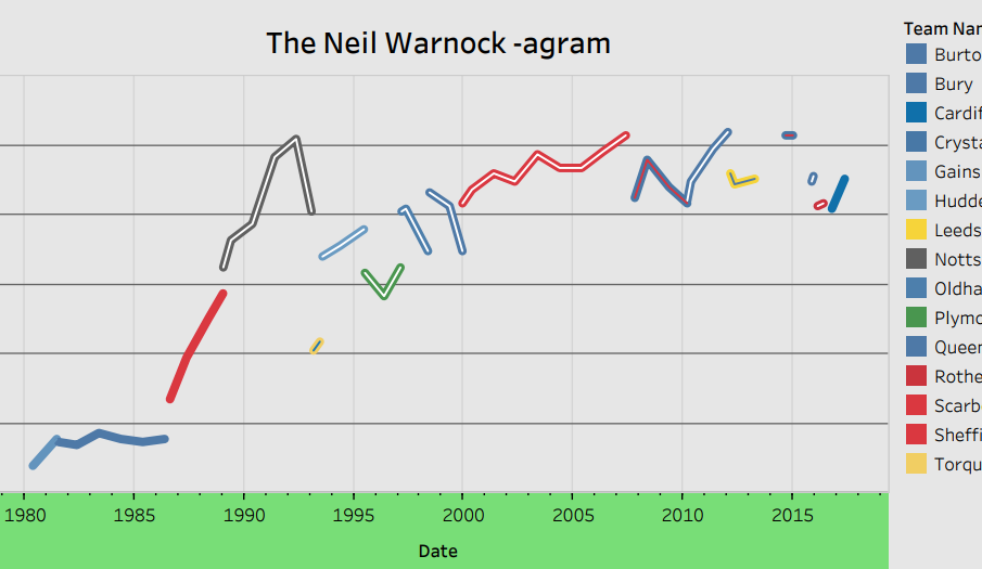
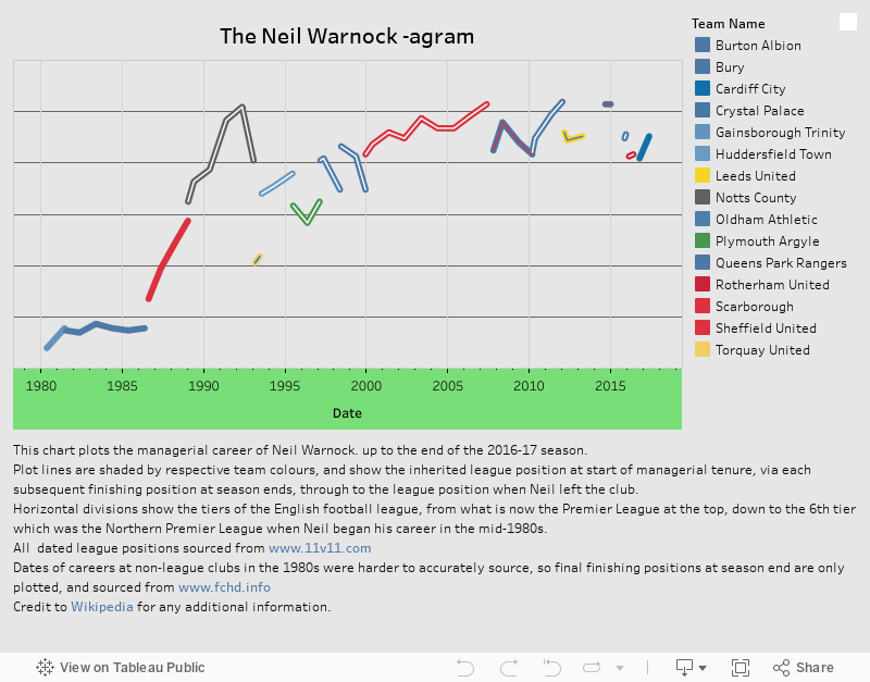
Indeed, NW seems the obvious candidate for all sorts of reasons – he’s managed 15 clubs to date, in all of the six top tiers of English league and non-league football, got teams promoted on 7 different occasions over a 30+ year career, and has the extra bonus of being one of those “Marmite” characters (if Marmite was universally despised by 95% of the population).
As a Bristol City fan of a few years, this naturally puts me in the 95% Marmite camp here, and I’ll admit to approaching this task with a mind to poke a bit of fun at Neil and his ilk… but in all honesty having collected the data for this, I find it rather speaks for itself.
And hopefully the picture I’ve come up with does so too.
Full screen version is here.
For this kind of data, a timeline versus league position line plot was always going to be the first port of call, and I had a few more esoteric adaptations in mind when I set out, but the simple graphic turned out to be totally up to the job so here it is.
It’s the obvious chart, but I’ve had a look around and haven’t found any prior versions of this kind of career representation – hence why I’m tongue-in-cheekily coining it the Neil Warnock-agram pending anything earlier turning up..
Plotting the team colours in the lines was interesting – there are way too many predominantly blue teams here to just plot teams in one colour, and anyway it’s a little disrespectful to the stripe-wearers et al. In the end I found that plotting two series on top of each other, with a wider line sitting behind a slightly narrower line allowed for the two colour effect. Sadly it’s not carried through to the legend colours – solving that problem can be for another day along with better highlighting of the promotion/relegation events.
Thanks are due to 11v11.com for the inter-season league tables, fchd.info for the 1980s non-league end-of season tables, and obviously Wikipedia for filling in some of the gaps. The non-league info from the early part of his career was a little bit hard to nail down, so that comes with a couple of caveats, but other than that hopefully everything is present and correct.
Leave a Reply